Learn the basic principles of writing for digital products, how it’s different from traditional copywriting, and why it might be a bad idea to hire your neighbor’s teenage cousin to do it.
Workshopping, wireframing, design, development, testing, launching — a website lives many lives before finally becoming more than an idea in a client’s head. One of these stages includes creating static copy found on digital products and services, known as UX writing. Suppose you thought about all other elements except this one. In that case, this blog will try to offer some answers on what UX writing entails and how it differs from traditional copywriting, as well as some useful tips and best/worst practices. However, a few disclaimers:
- This blog is the product of making mistakes and being slightly better next time. Like everyone else, I’m living life for the first time and figuring out stuff as I go.
- I’m a strong believer in not trusting strangers on the Internet, so take all this with a grain of salt and a critical mind.
- Much like a 5th grader trying to pass their gymnastics test in PE class, I, too, deserve to be judged by my best attempt. The latest one would be this website for sarcoma awareness.
- But enough about me, let’s get down to business.
What is UX writing
UX writing refers to the practice of writing copy a user sees when interacting with a digital product (commonly website, apps, webshops).
As its name suggests, the central role of such text is to guide the user through their experience in digital space, maybe even making it a bit fun and enjoyable, ultimately leading them to take specific actions. Sometimes the action is buying kitty litter, and sometimes it’s reading the benefits of vaginal suppositories. If you’re reading this, you’re a person who frequents online places, so you’ve undoubtedly encountered such copy on user interfaces: buttons, headings, error messages, instructions, and pop-up messages are just some elements commonly viewed as pieces of UX writing.
Why is UX writing important for user experience?
When talking about user experience, UX design may be the first thing that comes to mind. Imagine a sleek, SEO-approved webshop with a big header, informative carousels, a great categorization of products, maybe a cool navigation bar with unexpected animations. It’s pretty to look at and easy to browse, find information, or do the thing you came to do. That ain’t just down to looks, honey. If that same website had confusing textual elements or a lack of them, the only thing you’d be ordering is a hit on the development team.
The reason is obvious — you don’t just look at a website; you also read its content. This is why UX design isn’t enough, and we can’t think of the user’s journey from just a visual standpoint, because it won’t singlehandedly provide the user with enough context. Sure, most website users recognize shapes that suggest an element is a clickable button, but where does the click lead you? What action does it imply? That particular info is found in the microcopy known as CTA – call to action (Apply now, View details, Read more, Visit homepage, etc.)
Simply put, both visual and textual content must be created with the user’s behavior in mind, which is why UX writing and UX design go together like Apple Bottom jeans and boots with the fur.
UX writing vs. copywriting — what’s the difference
Ah, yes. If you googled “what is UX writing,” you probably also wondered how it’s different from traditional copywriting: writing slogans, blogs, commercials, etc.
Strategic writing for UX is primarily concerned with the user’s interaction with the digital product or service — is it easy, seamless, does the copy help them understand how to accomplish a task?
Copywriters are also information-oriented, but generally use different creative tools to gather the attention or even garner an emotional response from a potential customer. When you go download an app, you already intend to use it in some way — the will to interact is already there. A billboard by the side of the road, however, needs to make a person stop and look at it, whether because it’s fun, emotional, shocking, or claims to offer “70% off on all furniture”.
The copy/UX writer divide
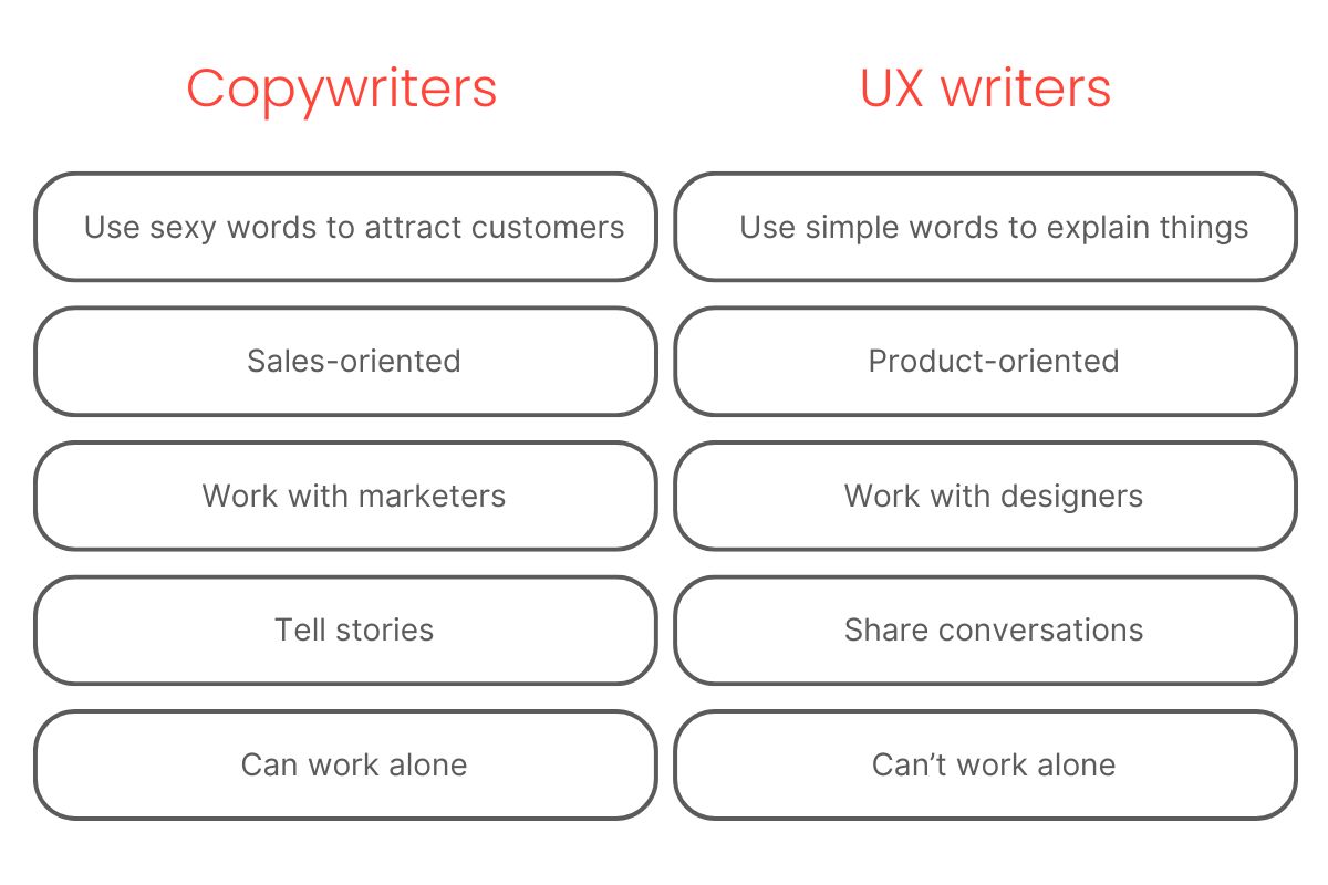
As you can tell, there are natural differences in the starting positions and end goals of both types of writing. Unfortunately, these tend to lead to divisive descriptions of the roles of copywriter and UX writer, like this one:

I wouldn’t say it’s wrong, but I think the two sides of the list overlap more than you think. Of course, there are varying perspectives, but here’s my take: individual fragments of text found on websites are all just copy. A headline for your header? Copy. A tiny CTA sentence placed above the “Apply now button”? Also copy. A descriptive sentence below a visual? Essentially, just a copy. The person writing static, small bodies of text in digital products is writing copy. Therefore, they can call themselves a copywriter if they wish. They should, if UX writing is just one of their skills, and writing websites or apps is just one part of their struggle job.
On the other hand, it makes perfect sense to be called a UX writer or web content writer, if that’s what you do 90% of the time. If you’re a freelancer, putting a UX writer title means clearly indicates that you want your next gig to be an e-commerce website, not a branding project. It also makes sense for a company mostly developing digital products or e-commerce websites to have a role solely designated to UX writing.
You might come across other titles and names. Some are a valid mix of the words “writer”, “content”, “digital”, “technical”. Some are simply stupid, and exist solely to stroke the egos of marketing geniuses or confuse people about the person’s actual role.
To conclude this topic, here’s an idea: try not to think of UX writing and copywriting as strict roles, but rather as skills you employ, depending on the nature of the project. Yes, the expertise is different, and yes, you can decide to become, or hire, one or the other. But the quality of both boils down to the same foundation: understanding how people think.
I have a cousin who writes well. Can she write my entire website?
Maybe yes, but most probably not. I have by my side IT project managers, developers, web designers, designer designers, and other copywriters for when I go insane and have to ask, “Hey, is this a word?”. If I had to name one advantage of hiring a web development/digital agency, it would be the team effort of different specialists all doing what they know best, giving each other advice, and coming up with solutions that are better than the sum of individual skill sets.
Also, no one is born with UX writing skills. You research, maybe take an online course, look at a gazillion websites, hone your craft like anyone else.
Well, that doesn’t sound too hard. Bet my cousin could do that.
I agree. But no sane person would do this unless it’s their job. If your cousin does put in the hours to do all this, then congratulations! Please refer her to our career page.
X tips for good UX
Well, the first one would be not to use Roman numerals in an effort to come off as smart. Others are:
Summarize, shorten, simplify
This is so obvious I might as well tell you that the sky IS indeed blue. However, omitting this would feel deeply wrong. Being short, sweet, and straightforward is much appreciated in digital surroundings. This doesn’t mean you should just be short for shortness’s sake. Just weigh every copy, and value the time of your user as if it’s your own.
Categorize and structure
Paragraphs, lists, bullets, categories, etc. — the human brain loves to see information divided into neat little compartments. Your brain included, so it will make writing easier, too.
Always provide enough context
You will probably go over the functionalities and user flow a hundred times. Be careful not to assume such knowledge from the user. It’s hard, but try to look at the project like it’s your first time and write accordingly: help users clearly understand where they are, why they should do certain actions, and what may come after that.
Write for your target group, not for yourself
There’s a lot of talk about human-centric UX writing/design. It might sound like you should think of yourself as the target audience, since you are (hopefully) human. However, don’t confuse writing in a human, accessible way with writing for yourself. Research your target, know their needs and how they act. Don’t just assume they’re the same as you. They might be, but try to verify that beforehand!
Forget fancy words (unless the target is fancy)
You might be compelled to defend your title as a wordsmith by using PERTINENT. This is entirely unnecessary unless you’re writing for English Literature PhD holders. Don’t underestimate your audience, but don’t ask for too much. They should be able to comprehend what you’re saying even if they’re having a bad day, or a single brain cell left after a rough night of partying.
Leave room for brand voice
UX writing is NOT the same as writing instructions on a lunchbox. Not every single copy will be instructional, and even when it is, your choice of words should reflect the brand’s overall image. A good writer can tell the difference between “Get in touch”, “Contact us” and “Give us a call, buddy”, and adapts their style according to both target audience and brand. This is where subtle skills and finesse really shine through, and it’s the reason why I think copywriting and UX writing are more similar than at first glance.
Participate in defining the informational architecture
This may not be the case in every agency, but I believe that a copywriter or UX writer should be included in forming the informational architecture of a digital product. Having a seat at the table from the very beginning of the project lets one share their vision of how information should be organized, and the contribution of a UX writer can only make things better.
Challenge your client
Clients have a particular vision for their project. They know everything about the topic, but your audience might need just 10% of that knowledge to complete their user journey. It’s the job of a UX writer to pick the 10% that’s essential and throw everything else away. Harsh, I know!!
Hypothetical situations and people are your friends
Imagination is a valuable tool. Often, it will come in handy to ask, “How would buyer persona A want to find this information? What would be their next step while browsing this web?” Sometimes, the hypothetical person can even be you, but remember the fourth tip and don’t just assume that your imaginary friend is the same as yourself.
Collaborate with UX designers and developers
If you follow advice number 7 and are in it from the beginning, you’ll have a better chance to share ideas with designers and developers. Working together, ebony-and-ivory style, will make your final product the absolute bees’ knees.
Good vs bad UX writing
Maybe you’re wondering if you’ll instantly recognize premium UX writing after reading this. You will be able to, but chances are, you won’t!
Like good UX design, good UX writing is invisible because it leads you to your destination with the ease and comfort of a trusty old pair of sneakers. A quality digital product doesn’t leave you thinking, “Good golly, what excellent UX writing and design. It’s more like, “Wow, finding info and buying this vintage Sailor Moon shirt was easier than I thought.”
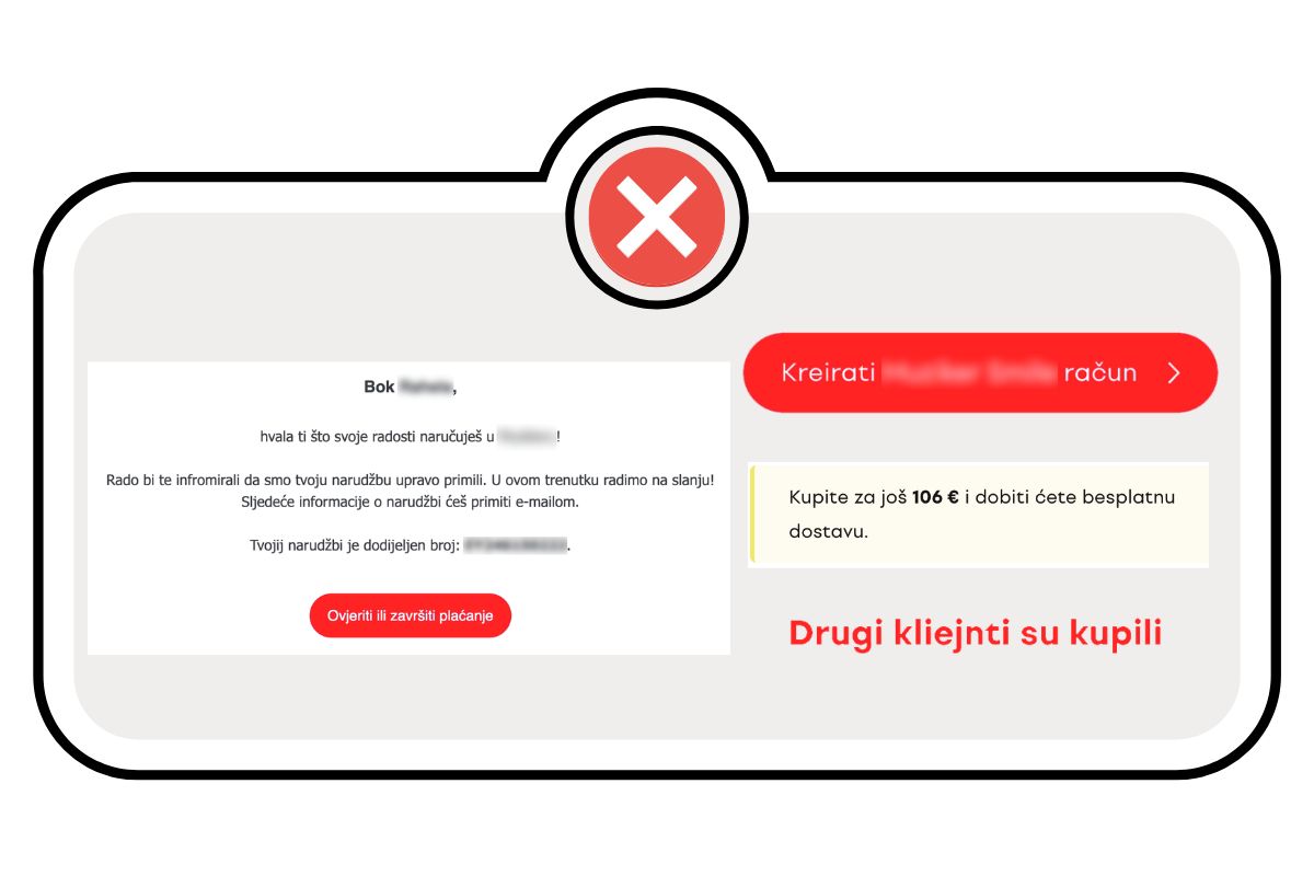
A thankless job, right? Maybe, but boy, is it obvious when it’s missing. Take a look at this:

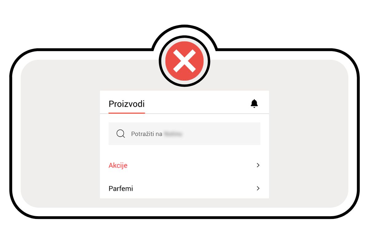
You can see that most bad UX writing examples are mistakes in language: obvious mistranslations, grammar or spelling mistakes, machine translations without any proper human quality assurance. As these are pretty obvious, they are also reasonably easy to avoid, but some language mistakes are more subtle. Look at this:

Not really jarringly stupid, and most users wouldn’t even notice it. However, in Croatian, using an infinitive of a verb leaves your copy dull and void of any energy, and since our language naturally loves inflections, an infinitive can sound plain weird. Switching it up with an imperative form of the same word is more natural, inviting, and makes the copy come alive in an instant — it becomes a direct call to action instead of just something to put so people kinda know what they’re supposed to do.
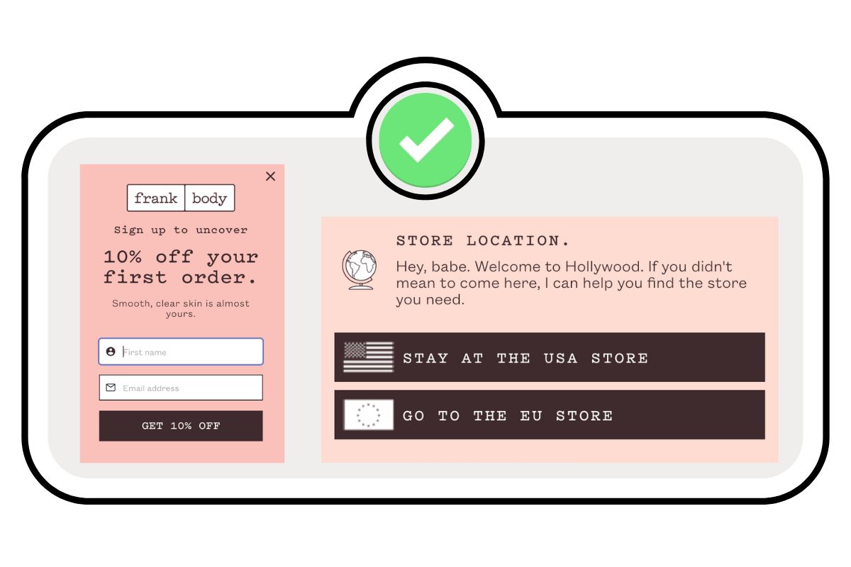
Now, I know I said that good UX writing gravitates more towards seamless and natural-sounding, less towards flashy. However, there are cases when I think “damn, that’s a good copy”. Like on this simple webshop from an Australian bodycare brand:


Examples such as these serve as masterclasses on how to blend traditional copywriting and UX writing. Yes, you’re writing practical microcopy, but still, make it sound alive, interesting, and most importantly, like the brand itself. If you think this isn’t always possible due to the miniscule size of text, think again!

These snippets perfectly demonstrate how to include brand voice in even the most instructional copies and in just a few words. Remember, a great dancer can cha-cha in the tiniest of rooms, aka, the lack of space is what breeds creativity!
This is also a great intro for my conclusion: great UX copy is never pushy. Think of it as the gentle guiding hand of your favorite teacher, a shampoo that works really well for your hair type, or a really charming, but easygoing salesman. Even when it’s noticeably clever, it never demands, it never steals the show, it just does its job by following basic principles. In this case: be concise, be simple, understand the user, and try to help.
Cool, cool, cool. Listen, I’m still gonna tell the neighbor’s kid to write me a website.
Oh hypothetical person inside my brain, how you fill me with joy and whimsy. Thank you, and may the odds be ever in your favor.


