Here at Degordian, people truly matter. As cliché as it sounds, we really do try hard to give people a reason to stay at the company, to provide them chances to develop into better experts and better people, satisfied with their work. In short, we want to foster a healthy company culture with loyal, engaged employees rather than cogs in the wheel.
We are a six-time recipient of the Best Employer award based on a nationwide employee survey, so it seems like the effort pays off. For an HR department, there is nothing more rewarding than knowing that employees feel the impact of your activities and that your work has tangible results.
However, we’re fully aware that there are certain areas that we still need to work on.
Knowing where to improve
To identify room for growth, we need in-depth data about Degordian employees’ satisfaction. That’s where Stethoscope comes in — the employee satisfaction survey we developed as a product to help HR and leadership make better, informed decisions. As always, the survey was sent to employees online, with different questions regarding criteria impacting their motivation and satisfaction. Only this time, we decided to do something different and post the results online.
Going public
Simply put, transparency is a big deal to us, so we wanted to publicly show what it’s like to work at Degordian. We also think this is helpful in the long run — we want to attract people who are a good fit for us, so why not show them factual information on life at our agency?
Consider this: a potential candidate values collaborative work cultures that nurture open communication. They would want to work in a company that ranks highly on this criteria, right?
For this reason, we display publicly what the people of Degordian are satisfied with and how much.
Let’s get those numbers out
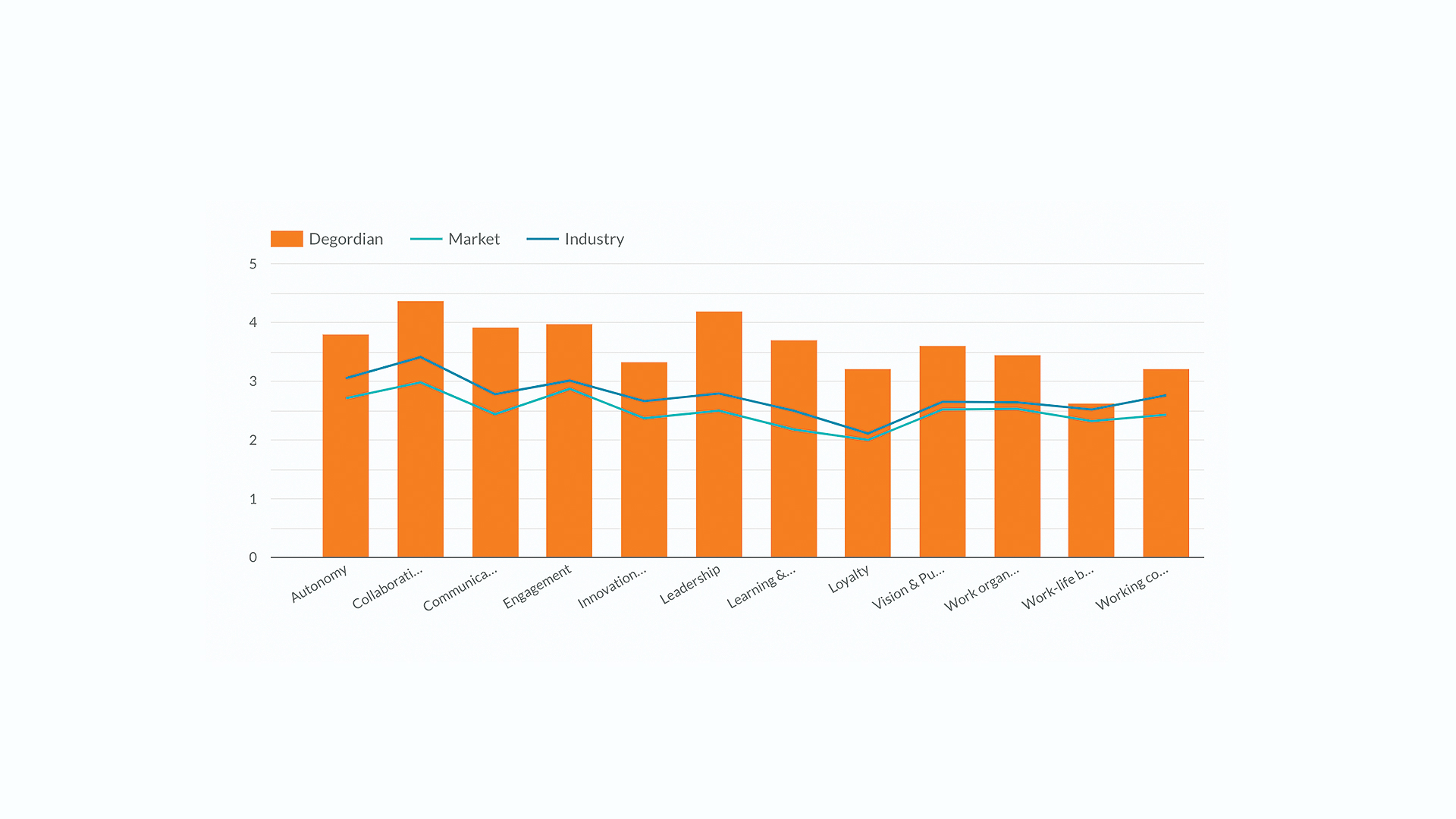
Before we start, it’s important to emphasize that the graphs represent averages across all categories. Also, results on certain topics vary from department to department, which is why we present only agency-level data (overall results). 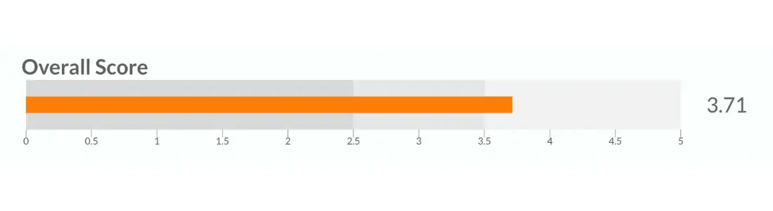
Our overall satisfaction score was 3.71 (on a scale from 0 to 5).
Now, without historical data or a benchmark, the data itself doesn’t explain much. When it comes to interpretation, context is everything. That’s why we introduced another set of results, to compare ourselves with the industry and market in general. 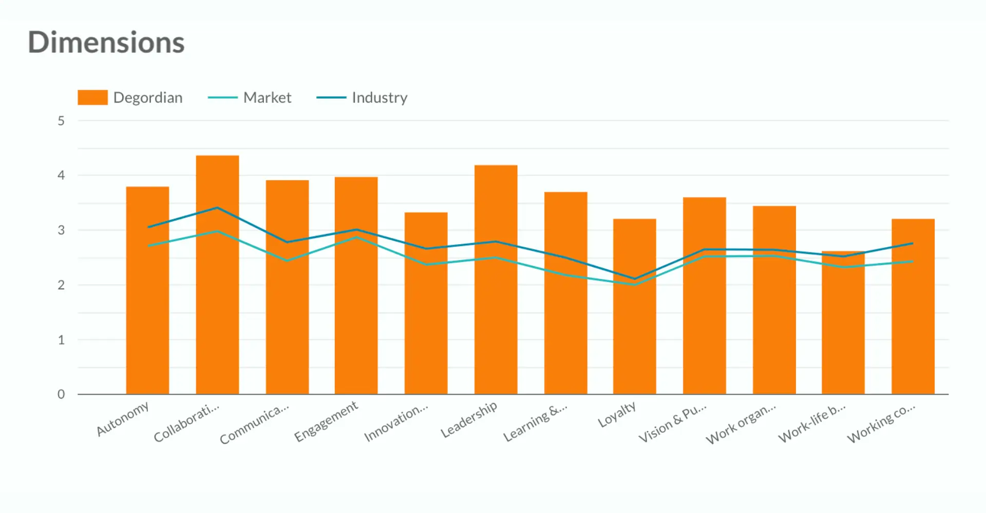
The market in question is the Croatian market (green line), and the industry is Marketing & IT (blue line).
Now that we have some context, we can conclude there’s much to be satisfied with since we’re above both the market and industry average in all categories, and in most, even far above.
That being said, there’s a difference between celebrating good results and being content. We want to do better, so we reassess what we do, try to identify bottlenecks and find room for improvement. The Stethoscope tool greatly contributes to identifying specific pain points since it gives insight into individual units and departments, or any other criteria we’re interested in.
Those precise, detailed results are exactly what we need to analyze employee satisfaction and engagement properly. But, more importantly, it’s a real opportunity to listen carefully to people.
For example, we are flexible and offer different work models, so the differences in results between remote and office-based employees help us review the disadvantages and advantages of both options.
In the same way, we can look at the results according to specific audience criteria — is there a difference in regards to length of tenure in the company, sex, organizational unit, hierarchy level, etc?
For an even more detailed insight, there’s the option of grouping multiple criteria. Meaning the tool’s filtering options allow you to drill down to the level of each question in the questionnaire. For us, this proved especially useful because of our unit structure — a low score on the same category can mean something completely different in various units and could be caused by a completely different reason, depending on the context.
E.g. for remote employees within a particular team, we can see the scores on each of the questions within the Autonomy category. We can additionally include a length of service filter on these data, and its that kind of in-depth analysis that allows us to create as many tailor-made action plans as needed.
Another important aspect for understanding our results is the following chart:
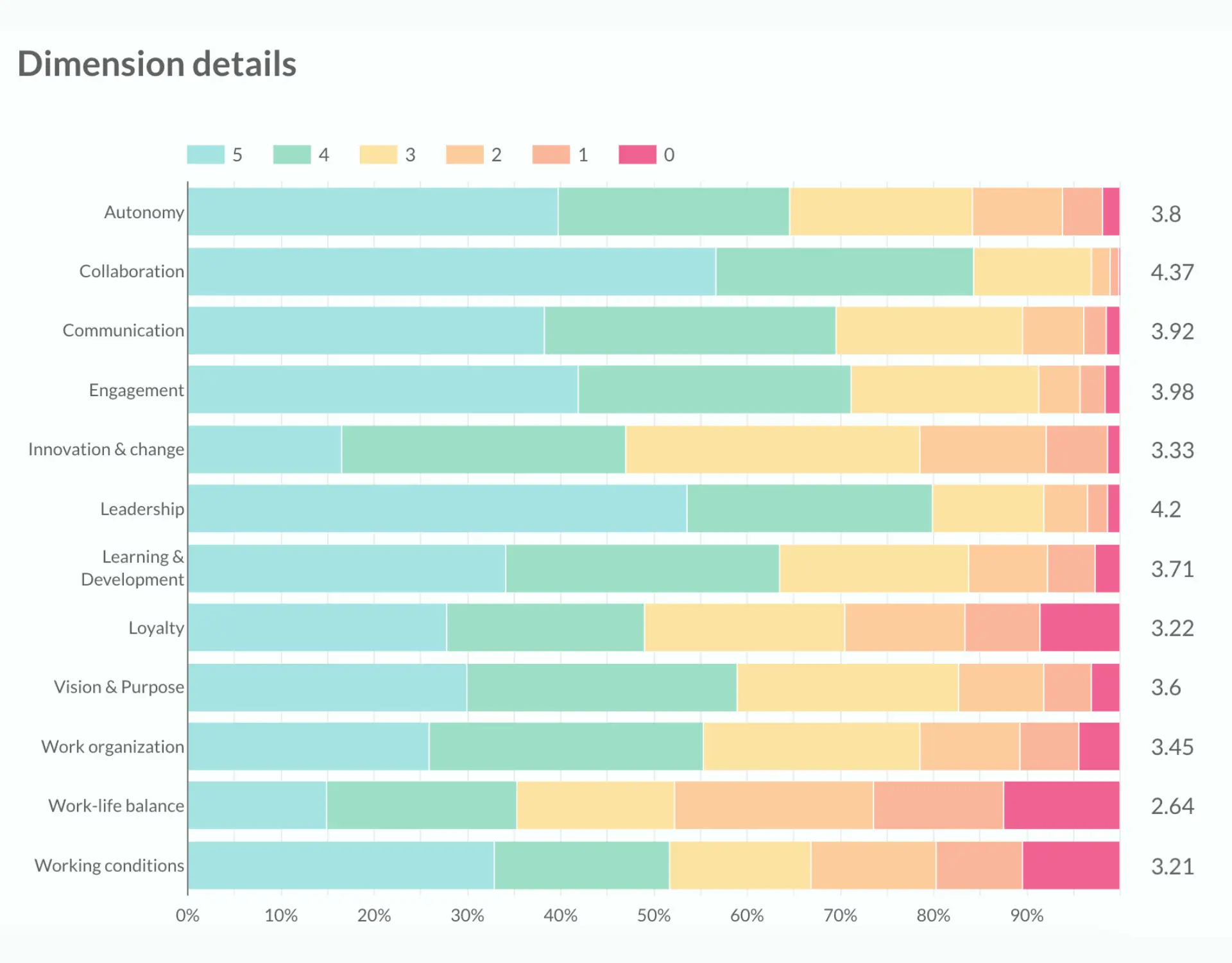
It shows the distribution of employees’ responses from 0 to 5, which provides more insight than just the average — we can see if there are more average answers, above average or below average in each key category. Again, the chart shows data on the level of the entire company.
According to these results, our lowest-graded category is Work-Life Balance. Although we work hard to improve this, the nature of our work is still working with clients. Everyone in a similar work environment (#agencylife) knows that there are periods when the workload is inevitably really high (at the end of the year, for example).
The following two lower-scoring categories are Innovation & Change and Loyalty.
In the past year, we had a lot of changes in the company — we opened a new office in NYC, launched a new product, and merged with a company in Serbia, which was naturally overwhelming for the team.
As for the Loyalty category, we plan on creating action plans to improve our retention rates. New employees can bring fresh ideas and expertise to the table, and a certain amount of change in the workforce is a healthy fluctuation. However, our employees are very close to each other, so colleagues leaving the company affects them too, and leads them to consider other opportunities. That’s why this insight helped detect our next target: working on retaining top talent, as well as developing processes to help attract new employees to replace those that do end up leaving.
On the other hand, we achieved a high score of 3.98 on a key category: employee engagement.
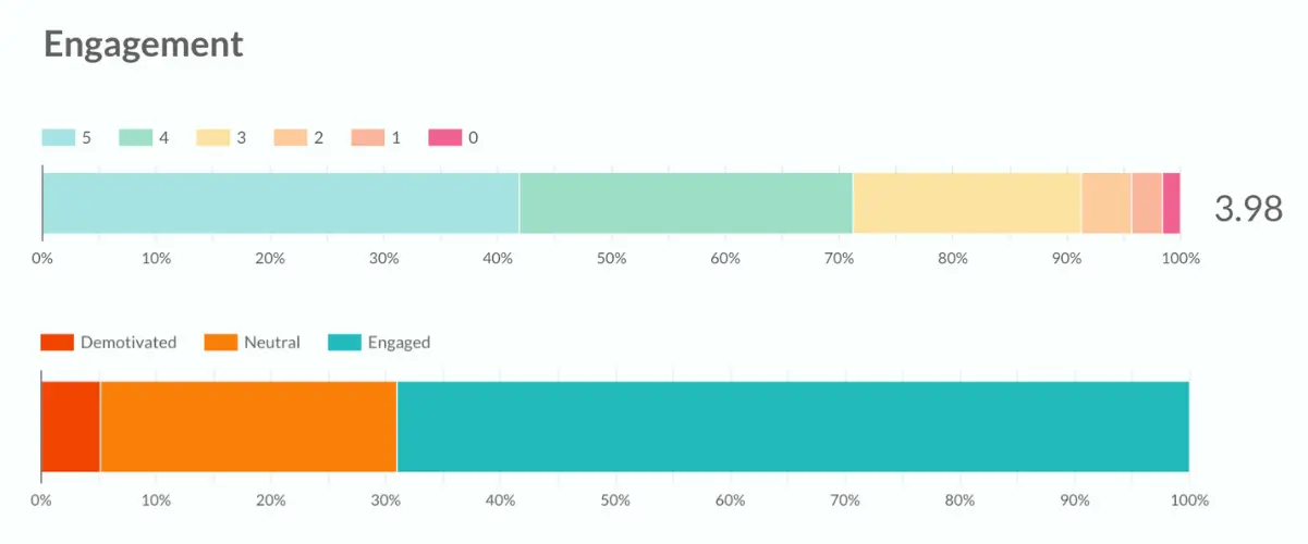
The achieved result is significantly higher than the average for our market (2.87) and industry (3.01). Nevertheless, we want to compare ourselves with those who are better than us, to be inspired, so that our focus and action plans reduce the red and orange categories.
We have all these results. Now what?
If you ask us, “involve to engage” is the way to go. We believe in making action plans, but not in the form of a list created only by management and/or HR. Instead, we wanted to build a system that encourages open, transparent communication and a free exchange of ideas, so our HR department conducts a workshop where we sit down with each unit leader and interpret the results down to the level of each of their subordinated teams. After identifying issues at a team level, employees are involved in creating action plans. Of course, the teams focus primarily on the lowest-rated scale at their level (the ones identified as pain points in their team, not all categories or questions).
Why we involve employees
This is simply part of who we are. We have worked hard to build a culture of constant feedback, and we want to continue in this direction. People should really feel that their opinion matters, that they can give their perspective on the causes of certain results, but also suggest ways to improve. This is a real win for leadership. With employees’ contribution in the creation of action plans, they gain deeper, complete insight into how and why things can improve, and they can also count on greater commitment from employees’ side when the time comes to put the plan in motion.
This research was carried out at the end of 2022, we had two Pulse surveys since then to check how things are going. We can already see improvements on all dimensions of the survey, and we’re proud that the initiated changes lead in the right direction.
Final remarks:
- We mentioned the importance of context. We also believe in having a hierarchy of importance of measured categories. For example, having lower results in a category the employees deem least important hints that it may not be a priority when creating an action plan (and vice versa). Seeing categories hierarchically listed helps you make an on-target action plan, so we made this feature available through the Stethoscope tool.
- Counting on the effect of recency, and on the fact that the information we see at the beginning and at the end is best remembered, we will use the opportunity to point out the extreme importance of anonymity. All answers are given anonymously, just as the findings of the Stethoscope tool are displayed anonymously. In the Stethoscope tool, you can’t filter down results to the extent that it will violate anonymity.
- Since we already had a tool that we believe is very useful for businesses, we went one step further and created a tool that anyone can use to check their level of job satisfaction with their current employer and see how they stand compared to the market and the industry they work in. Click here, fill it out and find out how satisfied you are.