Here at Degordian, we often get interesting and challenging requests from clients. An application that works through a motion sensing camera is definitely one of them.
When we got the project, I thought it was going to be very interesting because I’ve never had a chance to work with a motion-sensing camera (in our case Kinect), so I was a bit puzzled with the way it works and had to do a bit of research to get to know this little bugger.
A thing or two about Kinect
Basically, Kinect is this cool motion sensing thing that lets you control and interact with your console/app through body gestures and vocal commands. It’s placed with the screen facing the user and it detects his body, arms, and legs. It also records his motion, gestures, and speech, and transforms them into commands so you don’t need a controller or any of that 2009 stuff.
That’s cool but what if we turn it upside down?
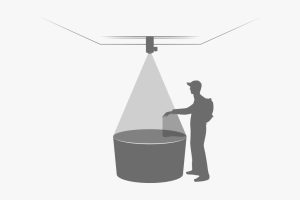
What the hardware spec and the brief stated is that we don’t have any TVs or physical screens to work with and that the app is actually going to be a projection on the table. Kinect was going to be placed on the top of the projector looking down on the table, so users can interact with the app using their hands — grabbing and pulling various objects to reveal content. Fun, right?
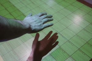
Taming the shadow monster
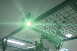
Before we started designing, we wanted to test our gear to see what we are working with and how to approach the design. In these kind of situations, you would usually have two projectors on opposite sides. They would cast a projection on a surface at a predefined angle so it doesn’t create shadows from the user. In our case, we only had one and it needed to be right above users.
A hand hovering over a projection created a very sharp shadow on the table, and we spent days trying to find out how to solve this challenging problem. Then we figured out how to turn that into our advantage.
The thing is since there is no click or touch on Kinect, you need some kind of guidance for your movement, something like a cursor to show you where your hand is pointing at. If we had a screen, we would probably go with the cursor, but here we decided to remove the cursor and use the shadow as a guide. At this point, I felt like we were the smartest people on this planet. 😀
Designing the feedback
When you remove touch or a click, you need to get creative with action feedback towards users. Using only your hand as a controller meant we needed to be very careful in order to let our users know they have made a certain action or that some request is being processed.
We put a lot of effort into designing various interactions for this app using animations, color change, shape shifting and of course textual explanations to guide our users through the app.
For example, when a user hovered his hand over some item and closed their fist, that item would pop up and change color so the user knew he grabbed it. The user would then continue to drag the item and when it got to a certain area, the item would snap into its place thus letting the user know he could release it.
I would say that designing the actual UI for this wasn’t that much different from designing for a screen, but the big difference was in designing interactions that you usually don’t do at this level of detail because of the comfort of having a controller or a touchscreen.
Does it work?
We had a lot of interesting challenges during the creation of this app and 90% of those hard ones emerged in the development phase. Having both the design and development departments (front and back) working on this app from the very beginning really paid off because we had a chance to solve most of the problems together. Every person working on it added a kind of positive impact on this app!
Oh and yeah, it works really, really great. 🙂